

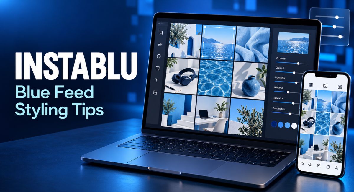
You edit a photo to match your blue theme, then notice that your white shirt and skin have turned blue too. The filter has gone too far. A good Instablu style starts with blue details in the scene, followed by gentle editing. You can build a clear theme while keeping people, food, and products looking true to life. This guide explains how to choose colours, take better photos, and plan a feed that feels connected without making every post look the same.
What Instablu Means in This Guide
Online articles describe this name in different ways, so it has no clear, shared meaning. Here, it refers to a blue Instagram style built through colour choices, backgrounds, and editing. Think of soft blue skies, denim, navy fabrics, and pale blue walls. You can use these details across photos, cover images, and simple text designs to create a similar mood.
A natural feed still leaves room for other colours. Skin keeps its own shade, coffee stays brown, and plants remain green. Blue acts as the colour that connects your posts. Your aim is to create a page where the images sit well together and each photo remains clear when someone views it on its own.
Choose a Small Colour Palette
Start your Instablu palette with one main blue and one supporting shade. You might choose denim blue with pale blue, or navy with a soft grey blue. Add a neutral colour such as cream, white, or light grey. Keeping a few saved colour samples makes it easier to match backgrounds, clothing, and text designs when you create new posts.
For example, a personal page could use denim clothes, cream walls, and pale blue details. A home decor account might pair navy cushions with light wood and white curtains. Try your colours together in a sample image before using them across your page. If they feel too dark or too cold, brighten the neutral shade or soften the main blue.
Find Blue Details Before Taking Photos
Look around for blue objects that already fit your daily life. A mug, notebook, shirt, tiled wall, or piece of fabric can become part of a photo. Outdoor scenes offer sky, water, and painted doors. Choosing these details before taking a picture gives you a stronger starting point than trying to turn an unrelated image blue later.
Use one clear blue detail rather than filling every part of the scene. Imagine a desk photo with a blue notebook beside a laptop and a glass of water. The notebook gives the image its colour link, while the desk and other objects keep it familiar. Move distracting items out of view, then check whether the main subject is easy to notice.
Use Light That Keeps Colours Clear
Good light makes an Instablu feed easier to create. Try taking photos beside a window where the light is soft. Outdoors, open shade can help you avoid strong shadows across faces, although it may also make colours look cooler. Take a test photo and check the result. The best place is one where you can see both colour and detail clearly.
When possible, avoid mixing window light with a strong yellow room lamp. Different light sources can make one side of an object look warmer than the other. Turn off the lamp or move closer to the window, then compare the photos. Use the better starting image instead of spending time correcting a colour problem that you could solve while shooting.
Set White Balance Before Adding a Filter
White balance controls how warm or cool a photo looks. If a white cup appears blue, the image may be too cool. If a grey wall looks yellow, it may be too warm. In an editor with a temperature control, make small changes until familiar objects look closer to their real colours. A neutral grey area can also help you judge the result.
For a natural Instablu look, begin with balanced colour before adding a cool mood. Blue objects can then carry the theme without changing the whole scene. Compare the edited photo with the original after each adjustment. You may still prefer a slightly cooler image, but check that white clothing, faces, and food remain believable. There is no single temperature setting that suits every photo.
Keep Skin Tones True to Life
Portraits need extra care because a blue filter can change skin quickly. Check the face, neck, and hands while editing. If they look grey, purple, or unusually blue, reduce the effect. Compare with the original photo rather than a fixed idea of how skin should look. People have different skin tones, and the edit should respect the person in the image.
The Instablu theme can come from the background, clothing, or small objects around your subject. If your editor allows separate adjustments, apply the cool effect mainly to those areas and review the edges carefully. A person wearing a blue jacket against a cream wall may already fit your theme. The photo might only need a small brightness change and a cleaner crop.
Control Colour Strength and Keep Texture
Saturation changes how strong colours look. Increasing it across the whole image can make blue attractive at first, but it may also make lips, grass, and food too bright. Start with a small adjustment. If your editor lets you change individual colours, work on the blue range and check every blue object afterward. Similar colours can change together, including details you wanted to keep.
Preserve texture as you edit. You should still see the weave in denim, the folds in a navy shirt, and the detail in clouds. Very dark shadows can hide these features, while heavy sharpening can make edges look rough. Zoom in to inspect the subject, then view the full photo again. The image should look clear at both sizes.
Plan Several Posts Together
Before publishing, place a few images beside one another in a simple preview. For an Instablu feed, check how the blue shades and overall brightness work together. You might balance a dark portrait with a bright room photo, then add a detail shot. This lets you spot sudden changes without forcing your page into a strict pattern.
Try a small plan with six photos you already have. Choose two people or product photos, two wider scenes, and two close views if those subjects suit your page. Move them around and notice which combinations feel comfortable. Treat the preview as a guide. Each post should still have a useful reason to appear, even when people see it away from your profile grid.
Make Covers and Text Easy to Read
Cover images can repeat your colours more clearly than everyday photos. Use a saved navy, pale blue, or neutral background, then keep the wording short. Choose text with enough contrast to stand out. Dark blue text on a pale background is a useful starting point. Leave space around the words so they do not compete with faces or important objects.
You can carry the Instablu look into Reel covers and carousel opening slides without making them identical. Keep the font and colour choices similar, while changing the photo or heading to suit the topic. View each design at a small size before posting. Preview the crop in the app too, as words near the edges may be cut off in some views.
Build a Simple Instablu Editing Routine
A repeatable editing routine saves time. Begin by choosing a sharp photo with a clear subject. Crop it, adjust brightness, and correct any unwanted colour cast. Then review the blue tones and apply a gentle filter if it helps. Finish by checking skin, white objects, shadows, and fine details. Save the original so you can return to it if the edit stops looking natural.
Once you like the result, save the settings as a starting preset if your editor supports it. Test that preset on several photos taken in different light. A setting that suits a beach image may look too cold on an indoor portrait. Adjust each image as needed. Reusing the process is helpful, but copying the same settings without checking the result can create uneven colours.
Match the Theme to Your Page
A travel page can build its colour theme around water, skies, and clothing. A fashion account can use denim, navy outfits, and simple backgrounds. A food page needs a lighter touch because heavy blue edits can change how meals look. Blue plates or napkins give you a colour link while allowing fruit, bread, and sauces to keep their real shades.
If you sell products, check that the Instablu style keeps their colour accurate. Photograph an item in good light and compare the edited version with the real object. A blue background can support the design without changing the product itself. Keep a sample photo nearby for future shoots, especially when you need several images of the same item taken on different days.
Refresh Your Feed Without Replacing Everything
You can introduce a blue theme through new posts. Review your recent photos and find colours or subjects you can carry forward. Perhaps you already use denim, grey backgrounds, or outdoor light. Start there, then add matching details to your next few shoots. A gradual change gives you time to test the style and see whether it suits the content you enjoy making.
Older posts can remain useful even when their colours differ. Focus on making your next set of images work well together. You might update a few cover designs or choose a simpler background for new photos. Keep notes about what worked, such as a window location or a favourite blue fabric. These small records make future posts easier to prepare.
Let Useful Content Lead Your Design
A colour theme gives your page a shared look, but each post still needs something worth viewing. Share a useful tip, an honest product detail, or a moment with a clear story. A caption can explain what the photo alone cannot show. For example, a blue desk image becomes more helpful when you describe a practical way to organise the workspace.
Allow variety within the theme. A warm sunset or colourful meal can belong on your page when it adds something valuable. You can connect it through similar framing, a matching cover, or a blue detail in another slide. Review whether the design supports your message. If you are changing an image so much that the subject becomes unclear, simplify the edit.
Conclusion
A natural Instablu feed begins with thoughtful colour choices, clear light, and gentle editing. Choose a small blue palette, find real details that fit it, and keep skin and product colours believable. Plan several posts together, but give each image its own purpose. Start with a few photos and refine your routine as you go. A theme that fits your everyday content will be easier to maintain and more comfortable to view.
(FAQ’s)
1. What does Instablu mean in this article?
It means a blue Instagram style created through colour choices, photo backgrounds, and light editing.
2. Do I need a special app to make a blue feed?
No. A phone camera and an editor with brightness, temperature, and colour controls are enough to begin.
3. How can I stop my skin from looking blue?
Reduce the cool filter, check white balance, and let clothing or backgrounds carry the blue theme.
4. Does every photo need to include blue?
No. Neutral photos and other natural colours can add variety while similar lighting and framing connect the posts.
5. Can I create this style on a small budget?
Yes. Use window light, clothes and objects you already own, and the editing tools available on your phone.
Visit for more additional information: Zellow Magazine