

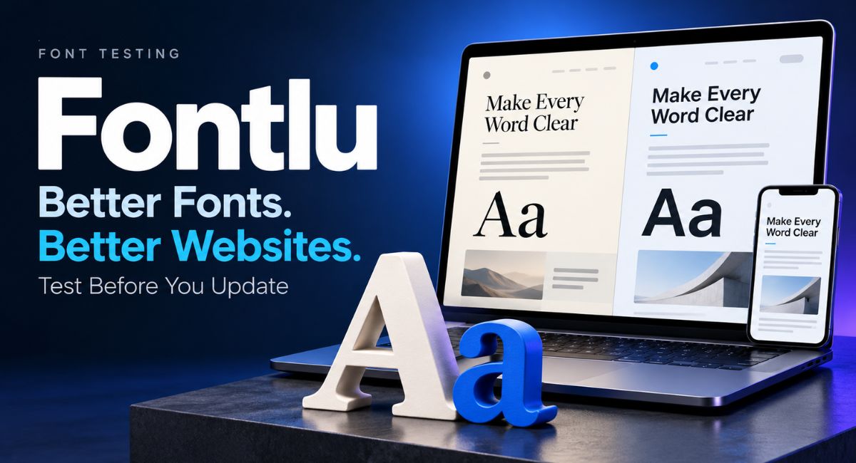
A new font can make your website feel fresh, but it can also turn a clear menu into a crowded line of text. You may like a style in a sample and dislike it across a full article. Fontlu gives you a way to compare text styles before making that choice. Testing first helps you spot reading problems, plan a cleaner layout, and avoid fixing the same pages again after an update.
What Fontlu Can Help You Test
The name appears on several font resources. Here, Fontlu refers to the browser font preview tool offered by Langlation. Its page includes controls for font size, weight, spacing, and colours. You can also compare fonts and view heading and body text pairs. These features support the early stage of choosing a website font, when you need to narrow down your options.
A preview helps you judge the appearance of text, but your website adds other factors. Your theme, content width, images, and buttons all affect the final result. Use the tool to select possible fonts, then check them on a private version of your actual pages. This gives you a fuller picture before you publish.
Why Font Testing Matters Before a Redesign
Fonts take up different amounts of space, even when they use the same size setting. A wider style may push a short heading onto another line. A heavier style may make a small navigation menu feel crowded. These changes can affect the balance of a page without changing a single word of your content.
Testing gives you a chance to catch these problems while changes are still easy. Imagine replacing the font on a recipe blog. The article may look better, but ingredient amounts could become harder to scan. Checking both areas before the update helps you choose a style that works across the site.
Start With One Clear Goal
Before looking through font choices, decide what needs to improve. Perhaps visitors find your articles hard to read on phones. Maybe your headings look too similar to normal paragraphs. A clear goal makes the search easier because you can judge each option against a real problem.
Keep the first comparison small. Choose your current font and two possible replacements. Use Fontlu during this stage to look at the same text in each style. Write down what improves and what becomes less clear. This approach is more useful than choosing a favourite simply because it looks different from your current design.
Check Readability With Full Paragraphs
Large sample words can make almost any font look attractive. Full paragraphs reveal more. Paste a section from one of your longer articles and read it at a normal pace. Look for letters that appear too close together, thin strokes that seem weak, or shapes that are difficult to tell apart.
Include numbers, punctuation, and any special characters your readers need. For example, a shopping page should show prices clearly, while a travel article may use names with accents. Read beyond the first few lines. A style that feels pleasant in a heading may become tiring when repeated across several paragraphs.
Choose Heading and Body Fonts That Work Together
Your main heading should stand out, while the article text should stay comfortable to read. You can achieve this with two fonts, or with different weights of one font. A bold heading above regular body text is often a useful starting point for a simple blog design.
When comparing pairs in Fontlu, keep the roles clear. Test your article title as the heading and a real paragraph as the body text. Avoid judging the pair using two short words alone. Check whether section headings, image captions, and small labels also fit the same style. A pair should work beyond the top of the page.
Compare Fonts Using Your Own Website Content
Sample text cannot show every problem your content may create. A short business name might fit almost anywhere, but a long article title needs more room. Use content from your homepage, a detailed post, and a page that contains a form. These examples cover different reading needs.
Move your shortlist from Fontlu into a private page preview before making a final decision. Compare the same pages with your current design and the proposed style. Keep the colours and page width unchanged at first. When you change too many things together, it becomes harder to understand which choice improved the page. Save a screenshot of each version at the same screen width. This makes small differences easier to compare and gives you a useful reference if you need to restore your original settings.
Test the Mobile Layout Before You Commit
Open the test pages on a phone as well as a computer. Pay attention to how headings break across lines and how easily you can follow an article. A title that fits neatly on a wide screen may take up most of the first screen on a phone.
Check practical areas too, including menus, search fields, prices, and button labels. Long words should stay within their boxes, and important labels should remain visible. Try both portrait and landscape views if possible. You are looking for a layout that still makes sense when there is less space around the text.
Adjust Font Size and Spacing Together
A font can seem difficult to read because of its settings rather than its letter shapes. Test body text at a few sensible sizes, such as 16, 17, and 18 pixels. These are starting points for comparison, not a rule that fits every font or audience.
Use Fontlu to explore line height and letter spacing, then check those choices in your page layout. For paragraphs, a line height around 1.5 to 1.7 can be a useful place to start. Read several lines before changing it again. Also check the width of the text area, since very long lines can make reading uncomfortable.
Keep Your Brand Style Consistent
Think about the feeling your website already gives readers. A local bakery may suit a warm heading style, while a business software site may prefer plain, clear lettering. You can refresh the appearance while keeping familiar colours, page structure, and a similar tone.
Use your Fontlu shortlist to compare possible changes beside your existing logo. Your article font does not need to copy the logo lettering. It should simply work with the wider design. Once you choose a style, record the settings for headings, paragraphs, captions, and buttons. Those notes help future pages follow the same approach.
Check Font Loading and Page Movement
A font that looks good after loading may behave poorly during the first moments of a visit. Web fonts need to be loaded by the browser. Depending on the setup, visitors may briefly see another font, missing text, or movement when the chosen font appears. Check the page while it loads, rather than only looking at the finished screen.
Try a slower connection in your browser testing tools and watch the main heading. Does it change width and push the content below it? Ask your developer to review font loading and the backup font if this happens. Load only the styles and weights the site actually uses. A visual preview cannot measure your website’s loading performance. A backup, or fallback, font is the style the browser uses when your chosen font is unavailable. It should keep the page readable while the main font loads. Ask the person managing your theme to check this setting. Choosing similar letter widths can reduce changes in line breaks, though it will not prevent every movement.
Make Text Easier to Use and Enlarge
Some readers need larger text to use a website comfortably. Test your pages at 200 percent zoom and check whether the words, controls, and labels remain available. W3C accessibility guidance includes text enlargement to this level without losing content or function. A quick check can reveal issues, though it does not replace a full accessibility review.
Look at text colour as well as size. Pale grey lettering may seem neat but become difficult to read against white. Check links within paragraphs, smaller captions, and form instructions. Also test what happens when spacing increases. Text areas should have room to grow instead of cutting off words inside fixed boxes.
A Simple Example From a Blog Update
Imagine a food blog with short recipes and longer cooking guides. The owner wants a cleaner appearance and chooses a narrower font for the test. The homepage looks tidy, but recipe temperatures become less clear, and bold ingredient names look too heavy. This shows why a single attractive page cannot settle the choice. The owner needs a font that serves both quick scanning and longer reading.
The next step is to compare the current style with a second option using the same recipe. The owner checks amounts, preparation times, and the article introduction on a phone. A slightly larger body size and a lighter heading weight may solve the problem without changing every part of the design. The final choice comes from reading real content and using the page, rather than selecting the most unusual style.
Bring Your Font Choices Into WordPress Carefully
Before applying a new style across WordPress, save a backup and record your current typography settings. If your host provides a staging site, use that private copy for testing. Theme options differ, so confirm where heading and body font settings are controlled before making changes.
Use Fontlu for the visual comparison, then apply your chosen settings through the options available in your theme or editor. Preview an older post, a new post, your homepage, and any important service pages. Check sidebars and footers too. If one area breaks, find the cause before adjusting text sizes across the whole site to hide it.
Ask Readers to Complete Simple Tasks
A second pair of eyes can spot problems you have stopped noticing. Ask a few people to read a paragraph, find a section heading, and identify the main action on the page. Choose people who are likely to use your website, rather than asking only those who enjoy design.
Ask what felt difficult instead of simply asking which version looks nicer. Someone might prefer a thin font but struggle to read the small captions. Record useful comments and make focused changes. After publishing, check the live pages again, since cached files or different devices may show results you did not see in your preview.
Conclusion
Fontlu can help you compare font choices before committing to a website update. The greatest benefit comes from combining that preview with checks on real pages. Read full paragraphs, test smaller screens, review spacing, and watch how text loads. Keep your choices tied to a clear goal and record the final settings. A successful font update should make the site easier to use while giving the design the fresh appearance you wanted.
(FAQ’s)
1. What is Fontlu used for?
It helps you preview and compare fonts before choosing text styles for a website or design.
2. Should I change every font during an update?
Change the styles that need improvement, and keep choices that already work well.
3. Do headings and paragraphs need different fonts?
No, one font with clear sizes and weights can work for both.
4. Can a font preview replace mobile testing?
No, you should also check your actual pages on smaller screens.
5. What should I check before publishing a new font?
Review readability, page layout, loading behaviour, enlarged text, and important buttons or forms.
You may also read: Yenkly com Technology Articles and How to Check Digital Advice
Visit for more additional information: Zellow Magazine